Megakill is your one-stop destination for all your software needs, offering comprehensive services to bring your ideas to life on the web or through custom applications. With expertise in software development and integration, Megakill empowers businesses with innovative solutions tailored to their unique requirements.
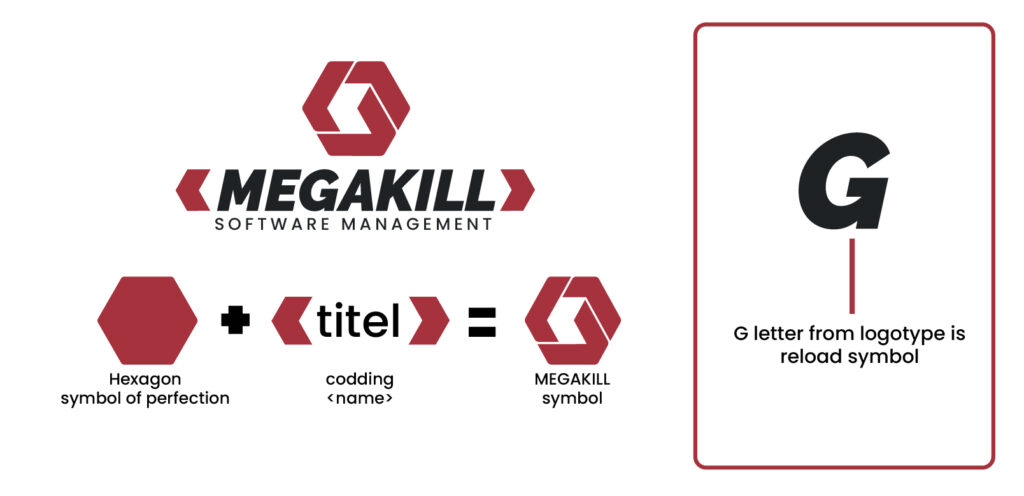
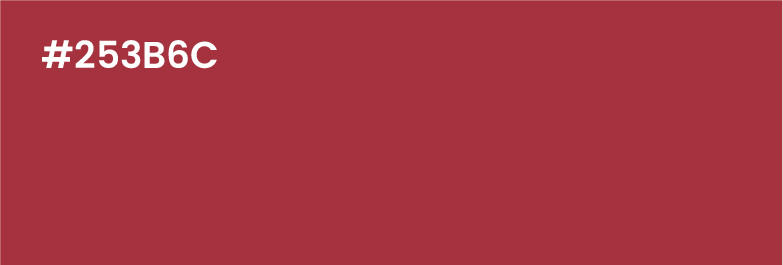
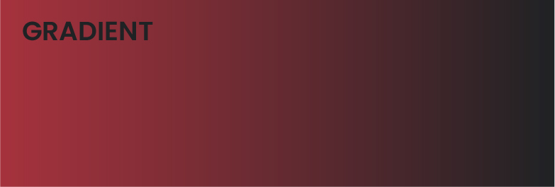
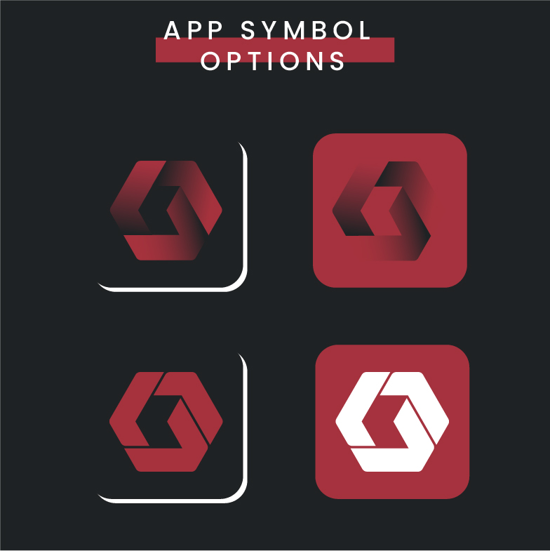
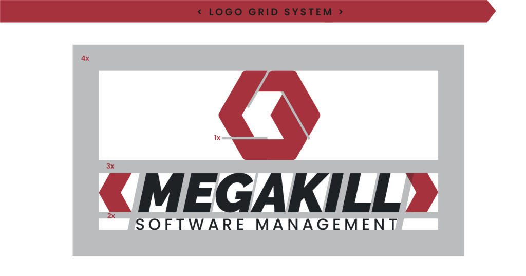
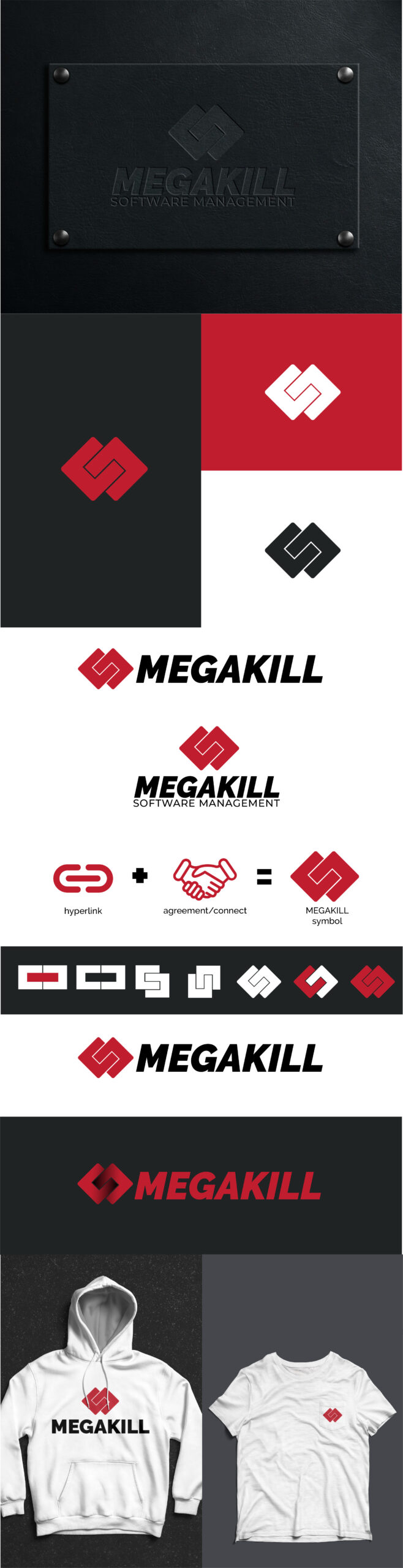
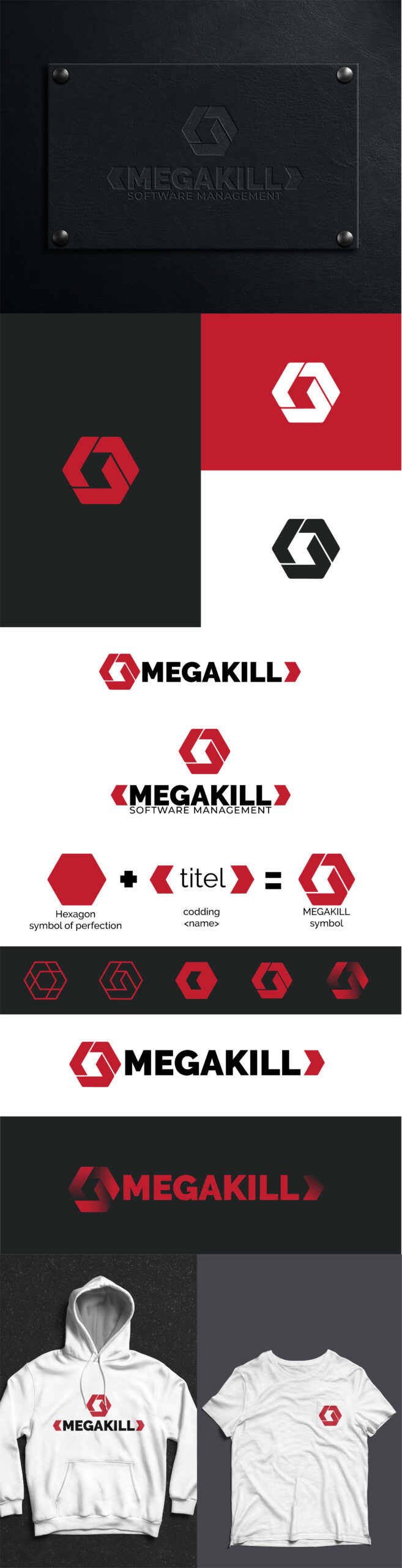
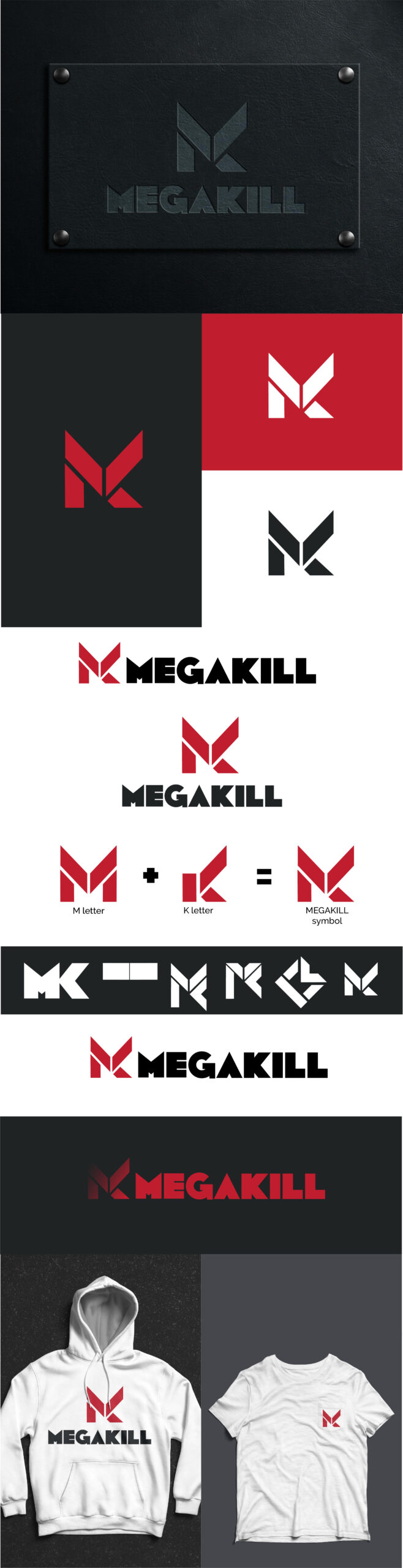
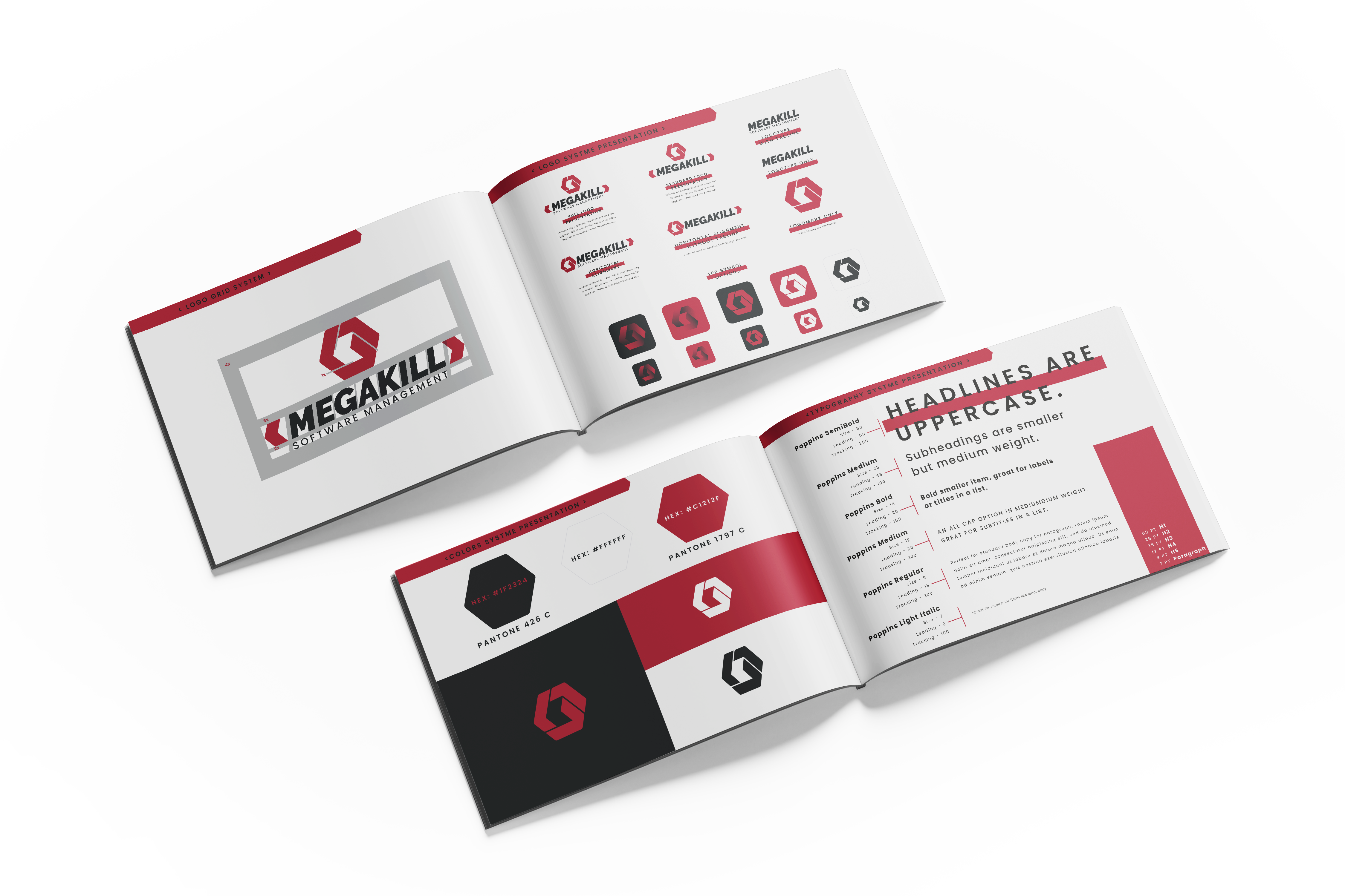
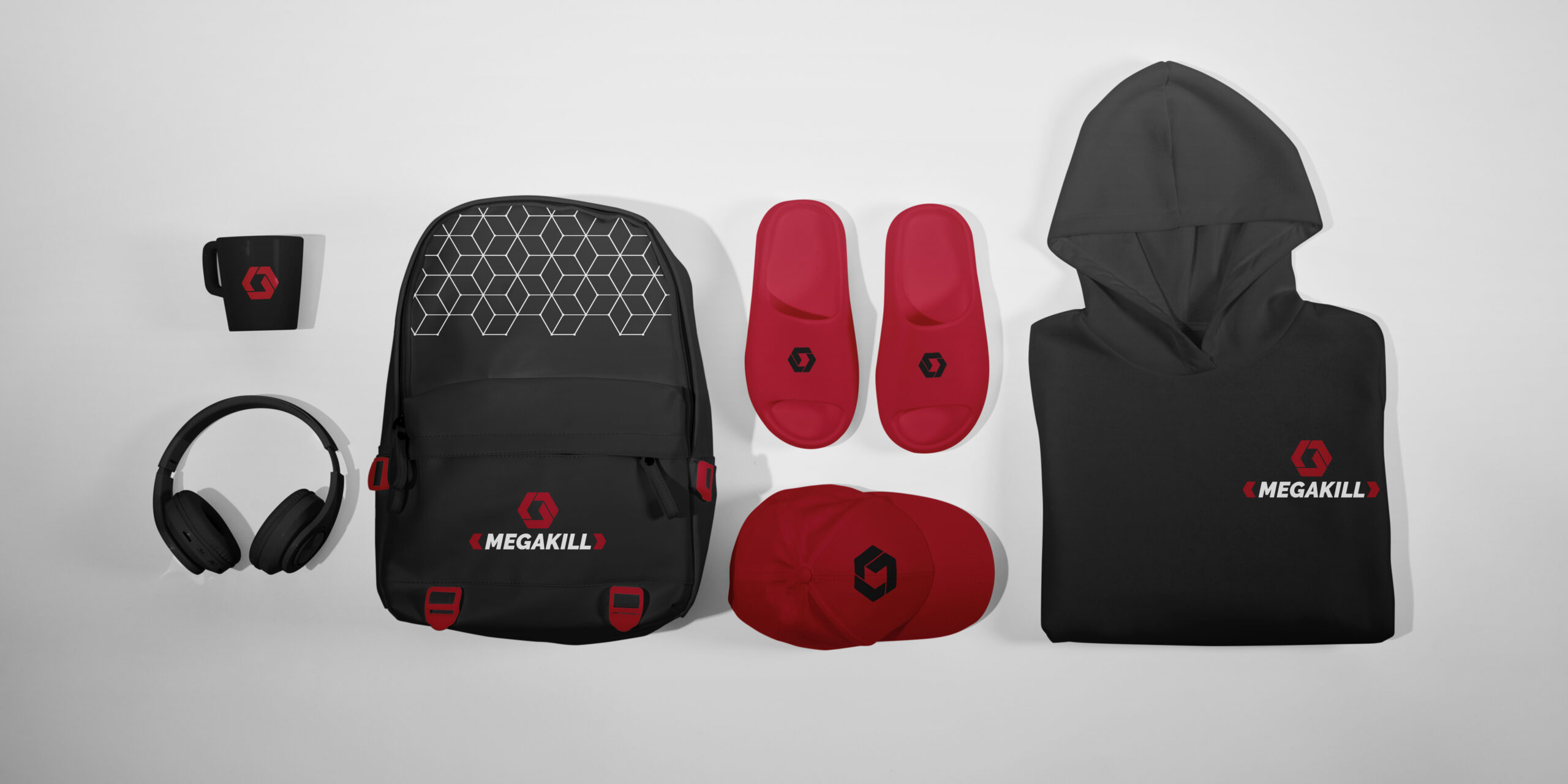
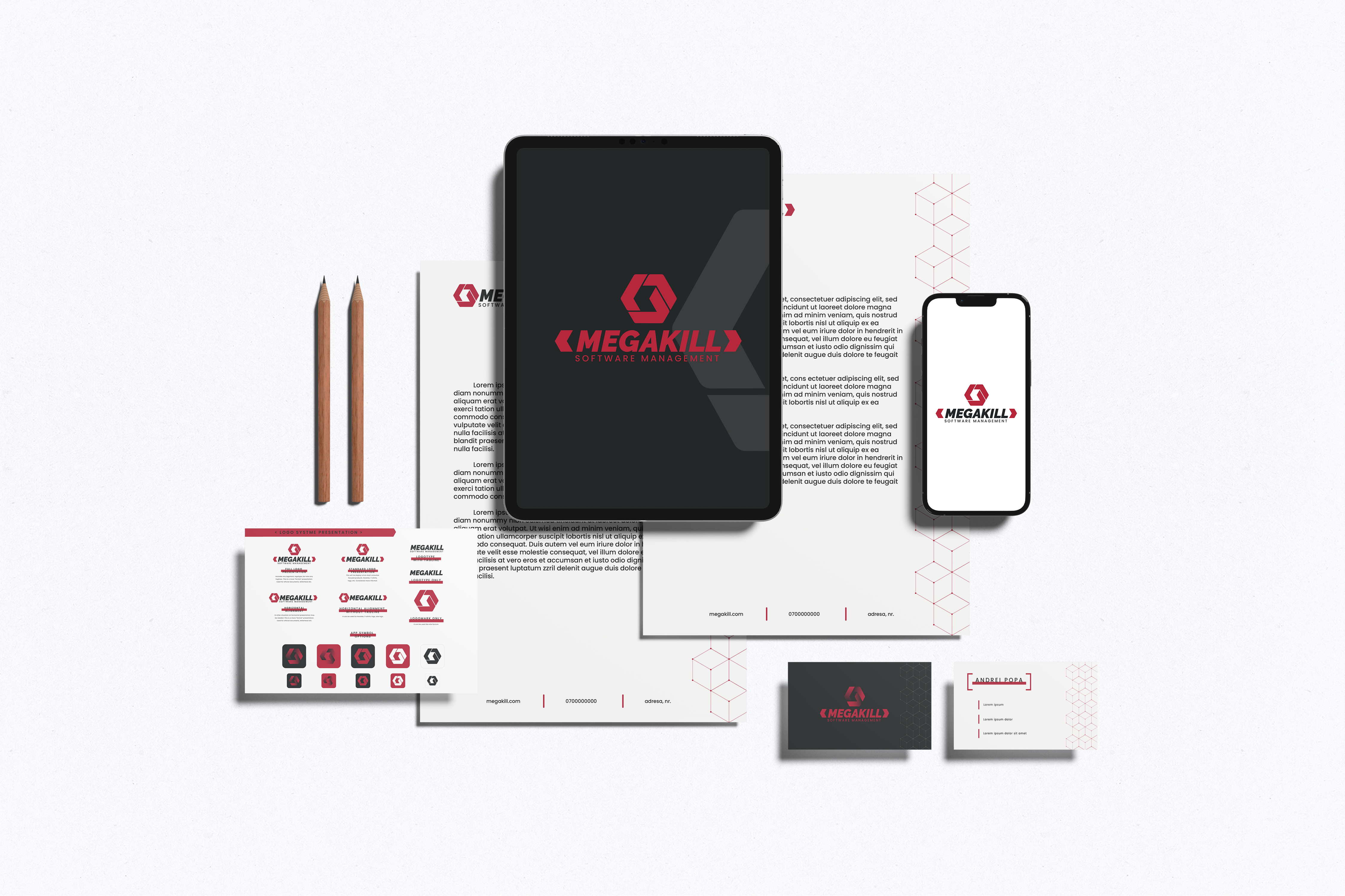
In developing the branding for Megakill, I decided to incorporate a color palette featuring red, white, and dark gray because red symbolizes power, passion, and energy, while white signifies purity, clarity, and professionalism. Dark gray adds a touch of sophistication and stability to the palette, reflecting Megakill’s commitment to reliability and precision in delivering software solutions. The bold and bald logo design exudes strength and stability, evoking a sense of confidence and trust in Megakill’s capabilities. The use of angled brackets (< >) in the logo, with the company name enclosed within, conveys the idea of code and programming, emphasizing Megakill’s expertise in software development. This cohesive branding approach communicates Megakill’s commitment to empowering businesses with powerful, innovative, and reliable software solutions.